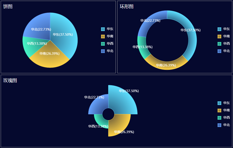
饼图、环形图、玫瑰图
在仪表板中您可以添加各种可视化组件来展示数据,本节以一张最简单的饼图、环形图、玫瑰图 组合示例为例带您快速了解创建仪表板的流程。
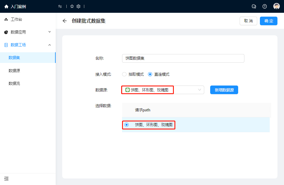
1. 数据准备
新增数据源并添加到数据集。
(1)数据源配置
| 数据源属性 | 属性值 |
|---|---|
| Web API地址 | https://result.eolink.com/jLwe6LL471d5112ef61d6b2ebe579a5190be3ee81164537?uri=/pie-chart-example |
| 请求方法 | GET |
| JSON路径 | $.data[*] |
JSON数据:
{
    "success": true,
    "code": 200,
    "message": "successful",
    "data": [{
        "id": "1",
        "eastchina": 37.5,
        "southchina": 26.39,
        "huaxi":13.38,
        "northchina":22.73
    }],
    "count": 1
}
注意:数值型数据不要添加双引号。
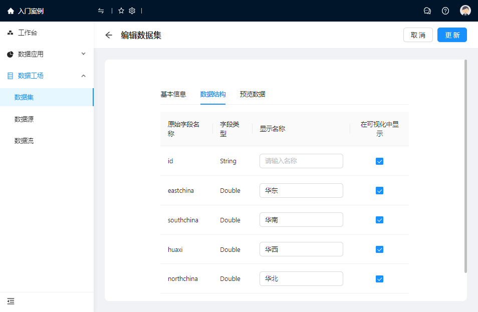
(2)数据集配置
2. 创建仪表板
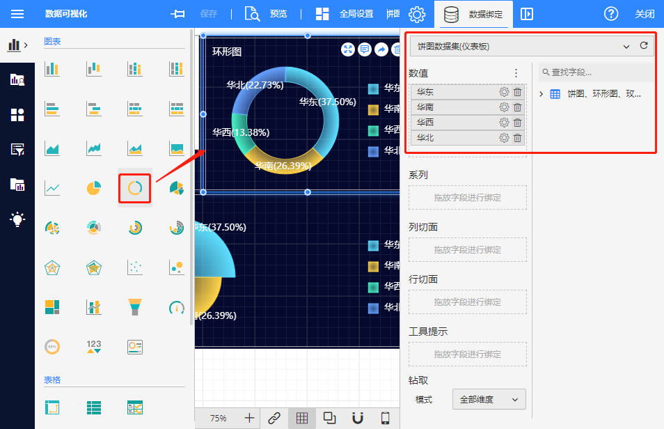
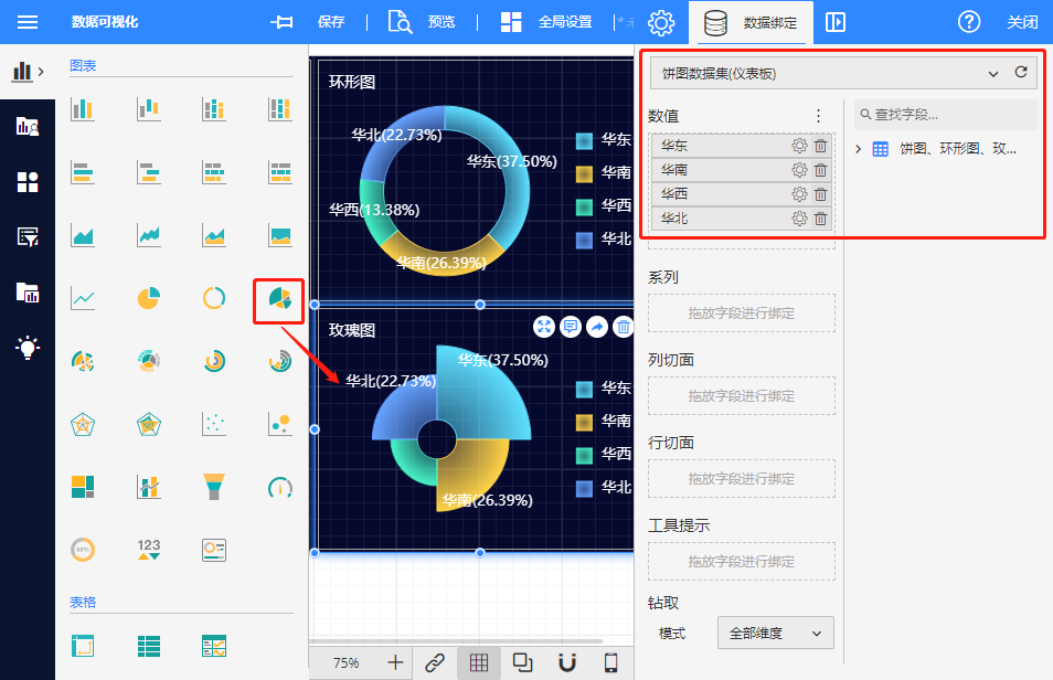
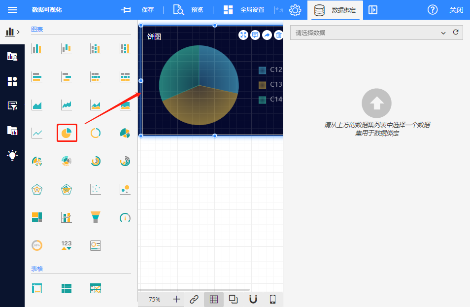
(1)添加可视化组件
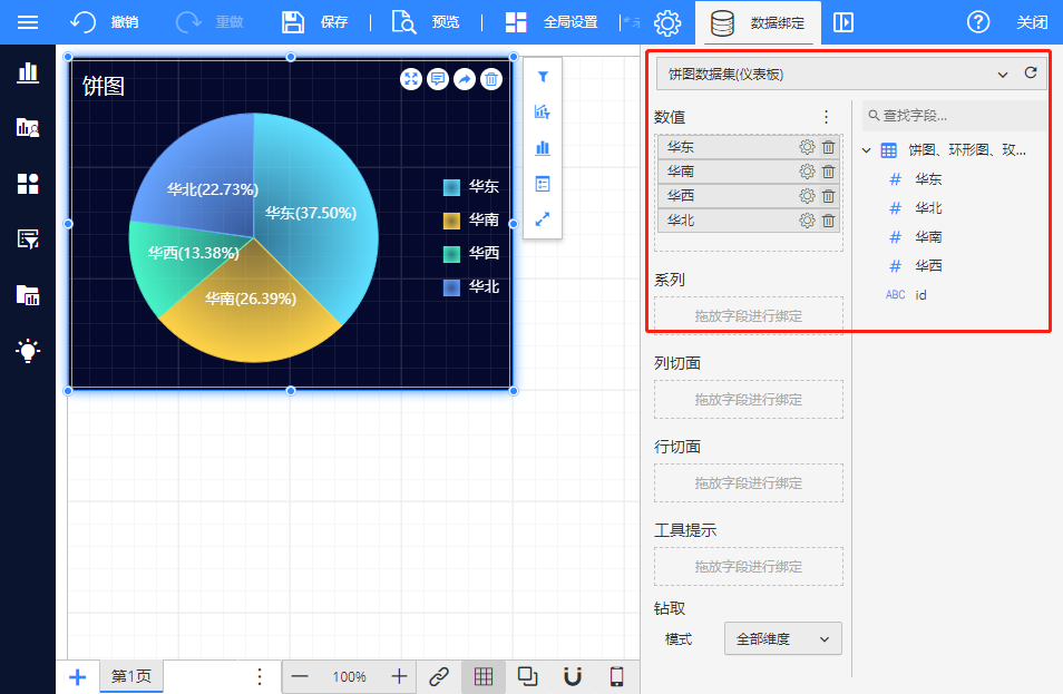
(2)数据绑定
选中可视化组件进行数据绑定。
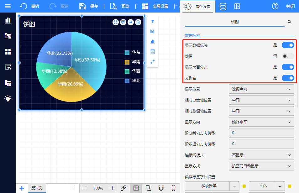
(3)样式设置
(4)其他饼图设置(同上)